
I worked on the the UX/UI overhaul of Shell’s internal Technology Delivery Portal, transforming it from a cluttered, content-heavy resource into a clear, user-first knowledge ecosystem. By auditing and restructuring the portal’s information, breaking dense text into modular components, streamlining navigation, and reinforcing visual consistency with Shell’s brand, I was able to significantly improve the user experience.
Our observations:
-
+40% in Content & Structure clarity
-
+32% in Approachability of content
-
+28% in Comprehension of information
-
+32% in Information recall
These improvements not only made the portal far easier to use, but shifted internal sentiment from "too dense" to "go-to resource" across Shell’s global P&T teams.
Explore similar projects:
Technology
Delivery Portal
Shell’s internal Technology Delivery Portal housed critical yet overwhelming content for global P&T teams. I led its redesign to simplify navigation, clarify communication, and bring consistency through a unified brand-aligned experience.
User Experience
User Interface
Visual Design
01-Understanding the problem and requirement
Brief
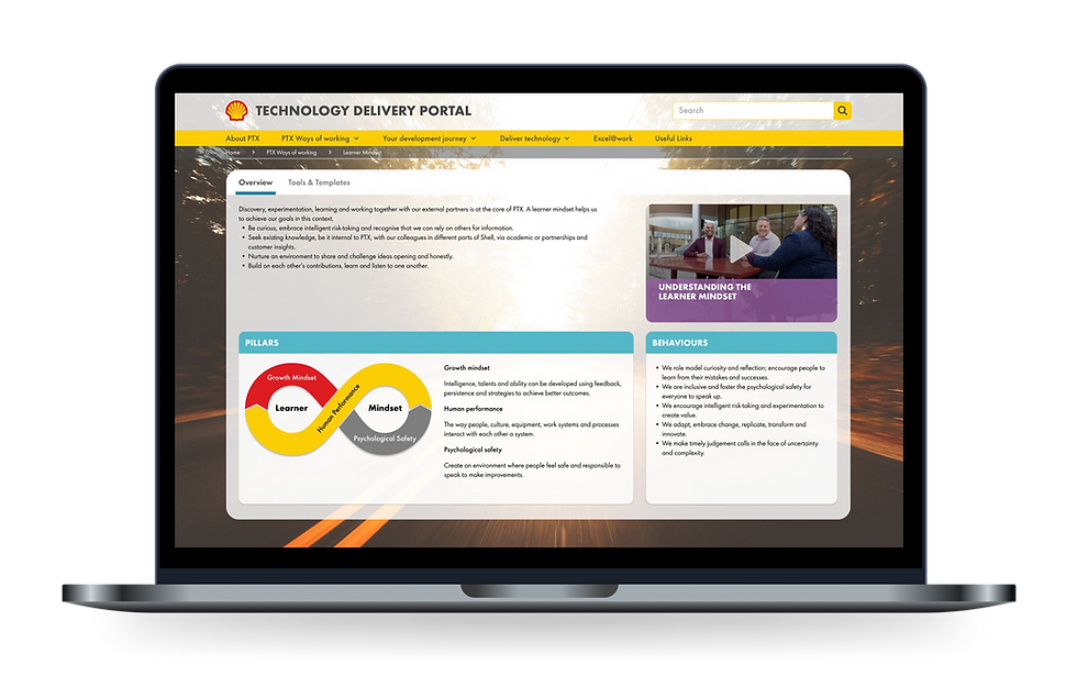
The Technology Delivery Portal (TDP) is an internal site that hosts key information and resources for Shell’s Projects & Technology (P&T) teams. However, users found it difficult to navigate and understand. The content was buried in long, unstructured text blocks, making it hard to scan, search, or locate specific information quickly, especially in time-sensitive workflows.
Context
The objective was to transform the Technology Delivery Portal into a clear, accessible, and user-friendly internal tool. The redesign needed to prioritize clarity, reduce cognitive load, and help Shell employees find critical information quickly, without having to sift through dense, unstructured content.
YEAR
2023
TYPE
B2C
My Role
I worked on the UX and UI design for the portal revamp. This included auditing existing content, designing a more intuitive information architecture, creating wireframes and UI components, and collaborating closely with the content owners and developers to ensure consistency and usability across the platform.
Premise
Long term use of a portal led to chaos and dysfunction.
The Technology Delivery Portal was designed to centralize high-priority information for Shell’s Projects & Technology (P&T) function. However, the scale and depth of the content posed a major UX challenge.
Each section contained dense, domain-specific knowledge across learning, processes, systems, and tools. The content was not only long, it was created by multiple contributors over time, resulting in inconsistent formats, voice, and navigation patterns. Pages were often cluttered with paragraphs of technical text, embedded links, and visual elements competing for attention.
Users knew the content was important, but engaging with it felt clunky and frustrating. Locating the right resource often meant scanning entire pages, trying multiple links, or toggling across sections. Interlinking was in jeoprady. The tone was inconsistent, the visual This wasn't just a matter of visual cleanup; it was a complex information design problem rooted in content governance, structural logic, and long-term scalability.
"Sometimes I open the portal, see the wall of text..."
Early-career engineer, Technology Delivery
KEY PROBLEMS
Antiquated design
Outdated architecture

02-Design
Design system is a superpower for clarity and consistency
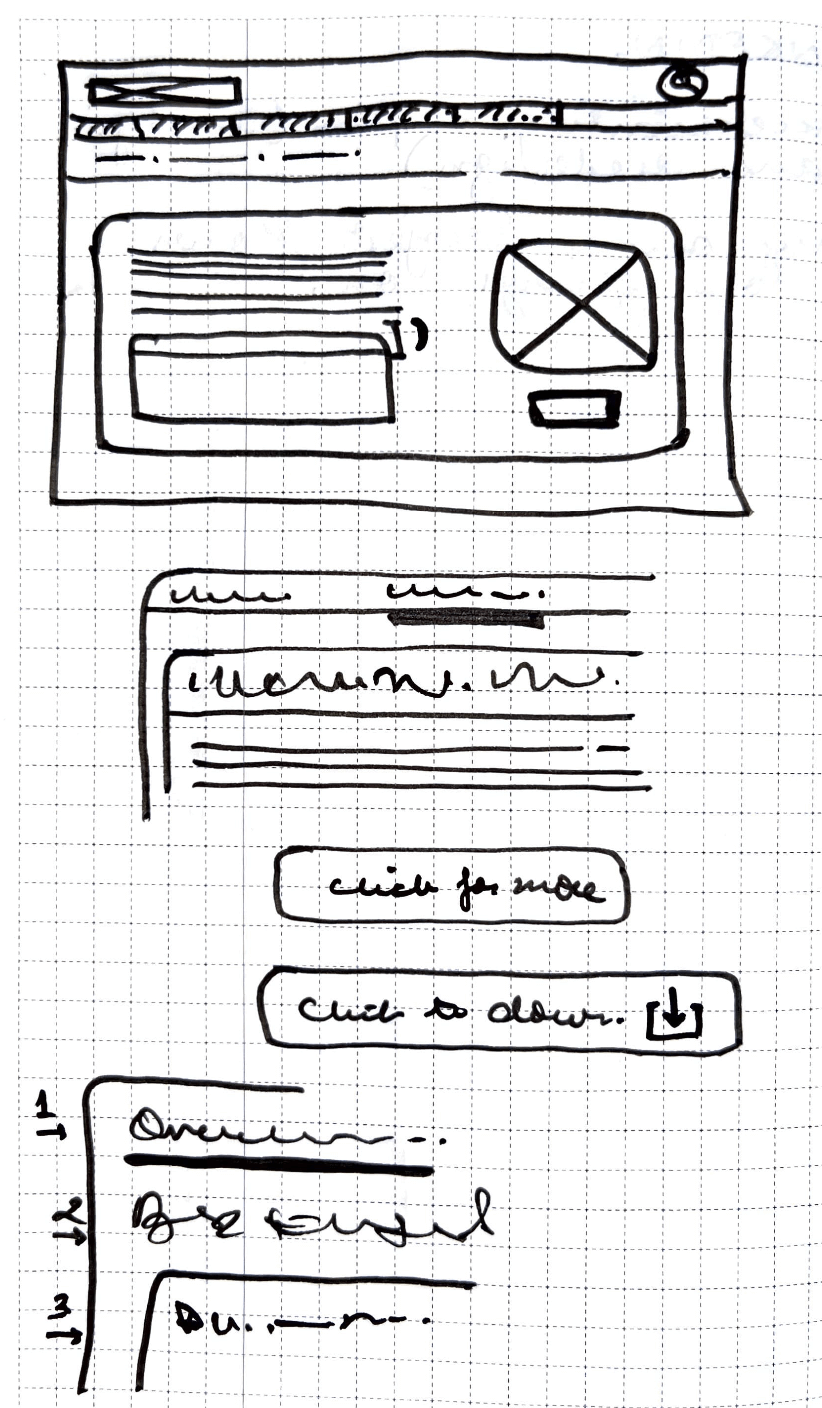
Operating within Shell’s brand environment, we made a conscious decision to push the internal design system further, to create coherence across the portal while preserving credibility.
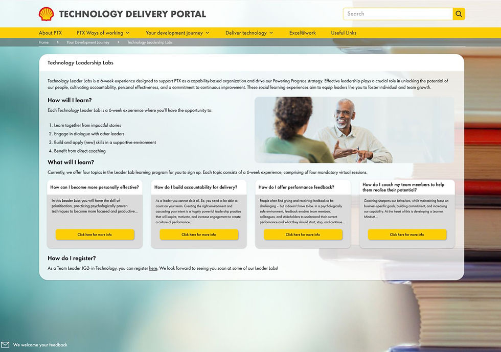
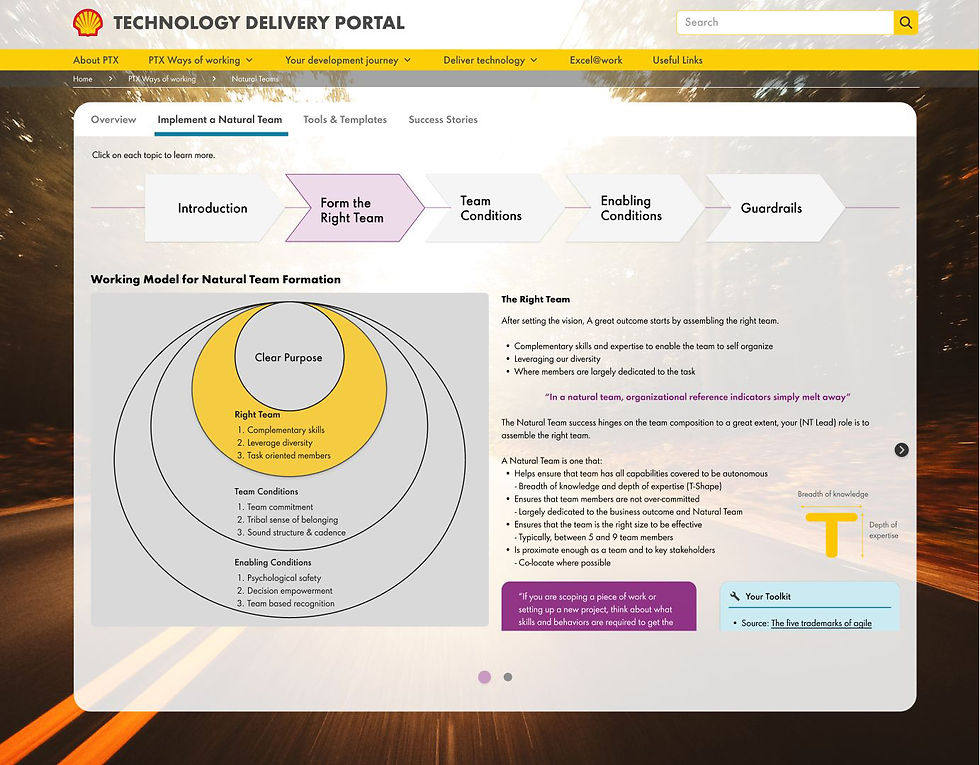
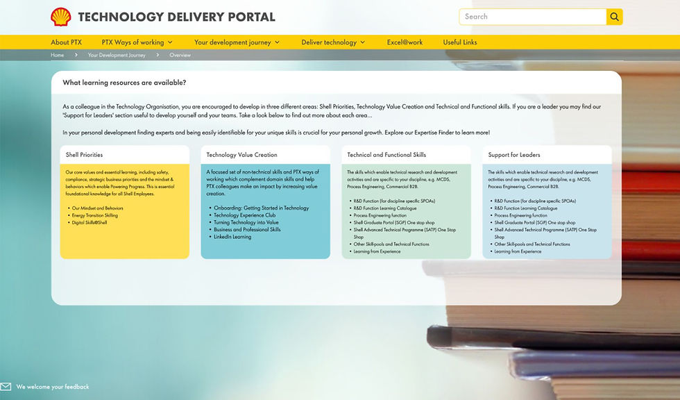
We simplified and unified the visual language using Shell’s brand typography, color palette, and layout principles, but applied them with greater discipline and structure. Page titles were re-prioritized. Key actions were surfaced through clear buttons and cards. Longform content was broken down using spacing, visual dividers, and pull quotes to improve scannability.
We avoided adding unnecessary visual layers—choosing instead to let white space and layout rhythm do the work. It was a design system for clarity, not decoration—anchored in brand, but evolved for real use.

Design system expanded for TDP portal
03-Portal


Improvements after the redesign
Below is a quantified design impact
Content and Structure
Score improved from 6.0 to 8.4
40%
improvement
Tonality
Score improved from 6.2 to 8.2
32.3%
improvement
Control
Score improved from 6.1 to 7.8
27.9%
improvement
Coherence
Score improved from 5.3 to 7.0
32.1%
improvement
04-Strategy
We treated the redesign as a systems problem, not just a UI exercise. Our strategy followed three interdependent tracks:
-
Content Rationalization
We conducted a section-by-section content audit, tracking duplication, structural inconsistencies, and outdated formats. This helped us scope the real effort needed and clarify where user confusion was coming from. -
Design for Growth
Rather than fixing individual pages, we created modular page templates and flexible content blocks that content owners could easily reuse and maintain, future proofing the portal beyond the redesign.
Information Architecture Overhaul
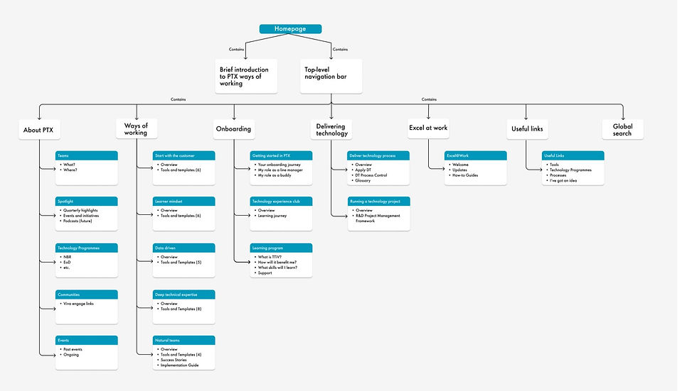
The IA redesign was one of the most critical parts of the project. We introduced a cleaner, top-down architecture with six core sections.
Each core section was scoped to reflect actual user tasks and journeys, rather than internal naming conventions. Dropdown menus were standardized and aligned with content volume and relevance. We also reduced nesting to ensure all key content was reachable within 2–3 clicks, no matter the entry point.
This IA overhaul didn’t just organize the site. It gave teams a shared mental model to manage and grow content more effectively.
05-Conclusion
We treated the redesign as a systems problem, not just a UI exercise. Our strategy followed three interdependent tracks:
-
Content Rationalization
We conducted a section-by-section content audit, tracking duplication, structural inconsistencies, and outdated formats. This helped us scope the real effort needed and clarify where user confusion was coming from. -
Design for Growth
Rather than fixing individual pages, we created modular page templates and flexible content blocks that content owners could easily reuse and maintain, future proofing the portal beyond the redesign.
To explore more projects, click here.