03-Process and approach
10 WEEKS
RESEARCH
In depth analysis of target audience, analysis of other suicide prevention services and reference gathering
USER EXPERIENCE
Personas, user flows and variables, inputs and rationales, content flow, and wireframes
WORKSHOP & TESTING
Exploration of variations of UI design, testing and revising, reconfiguring
USER INTERFACE DESIGN
Focused on selecting a visual concept, developing a design system, and assembling a UI kit
Establishing the branding
We spent a time establishing the branding by deeply studying the present and future of Outlive.

The source of all decision making was from understanding the offerings on the platforms and how they would be useful for our primary and secondary audiences.

And essentially with the collective knowledge and iterations, we came up with the right balance of ideology and identity that was brought forth.

Outlive
Suicide is the leading cause of death among young Indians, and Outlive needed a platform to reach out to young people in a judgement free, empathetic way.
User Experience
User Interface
Research and Workshops
.png)
I led the UX & UI redesign of Outlive.in, India’s first youth-centered suicide prevention platform. Our goal was to create a digital space that felt welcoming, easy to navigate, and culturally relevant for users aged 18–24.
Impact through research-driven design:
-
Outlive platform was co‑designed with 50+ youth advisors through workshops, ensuring the platform’s voice and structure resonated deeply
-
Public engagement reached 5,500+ youth across 85+ events in Delhi, Mumbai, and Pune via workshops and campaigns
Explore similar projects:
01-Understanding the problem and requirement
Brief
Outlive is a digital-first suicide prevention platform built for young people in India. I led the UX and UI design for the website, working closely with mental health experts, youth advisors, and developers to create an emotionally safe, mobile-friendly experience.
Outlive has since been launched nationwide, backed by mental health professionals and co-owned by the communities it serves.
Context
With suicide as the leading cause of death among Indian youth, we needed to build something that could meet users in moments of distress—with warmth, clarity, and zero judgment.
I mapped core user journeys, defined the site’s information architecture, and designed an interface that prioritised emotional safety through soft visuals, non-triggering content, and intuitive flows.
YEAR
2022
TYPE
B2C
The result is a platform that feels calm, trustworthy, and accessible, even in a crisis.
Premise
India’s youth are in crisis and help is hard to find.
Suicide is the leading cause of death among young Indians. While the numbers are staggering, what’s harder to see is the silent, daily suffering behind them, feelings of hopelessness, isolation, or panic that go unheard. Mental health resources exist, but they are fragmented, hard to access, and often alienating to the very people who need them most.
CRITERIA
User Experience
User Interface
"Sometimes I just want to talk to someone without having to explain everything from the beginning. I don’t want advice, I just don’t want to feel alone for a minute."
19-year-old student [F] [Mumbai]
“I didn’t even know what I was feeling had a name. I did not understand it enough to talk to my parents or friends about it.”
22-year-old working professional [M] [Pune]
Designing for distress means designing for
Clarity
Calm
Control
Coherence
02-Website
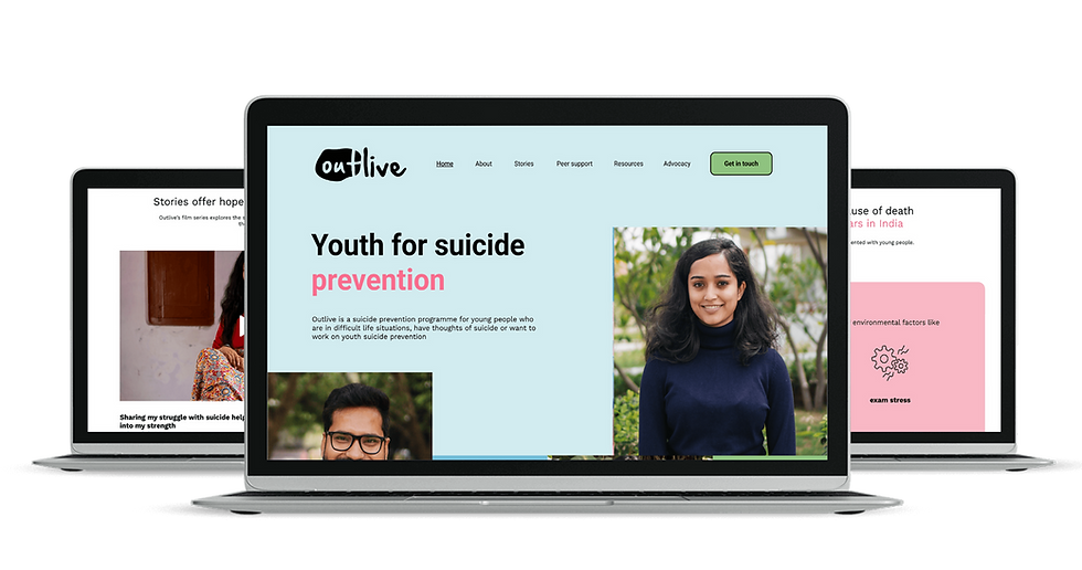

Approach
My approach for the project was with one guiding principle: emotional safety. Everything, from language to layout, is built around softly and slowly giving information and tenderly handing the resources and urgent information. The website had to feel non-judgmental, easy to navigate, and quietly reassuring.
My UX process focused on mapping the real-life states users might be in: feeling overwhelmed, wanting to help a friend, or simply needing to explore resources without pressure. We then built flows that honoured these needs with minimal friction and maximum clarity.
Visually, we avoided clinical cues. Instead, we leaned into warm, accessible UI, designed to feel like a conversation, not a diagnosis. The result was a digital space where support feels close, navigation feels intuitive, and even the smallest interactions offer relief.
I approached with a criteria of steering away from clinical cues and language, and guiding the "help seekers" via information of comfort and friendliness.

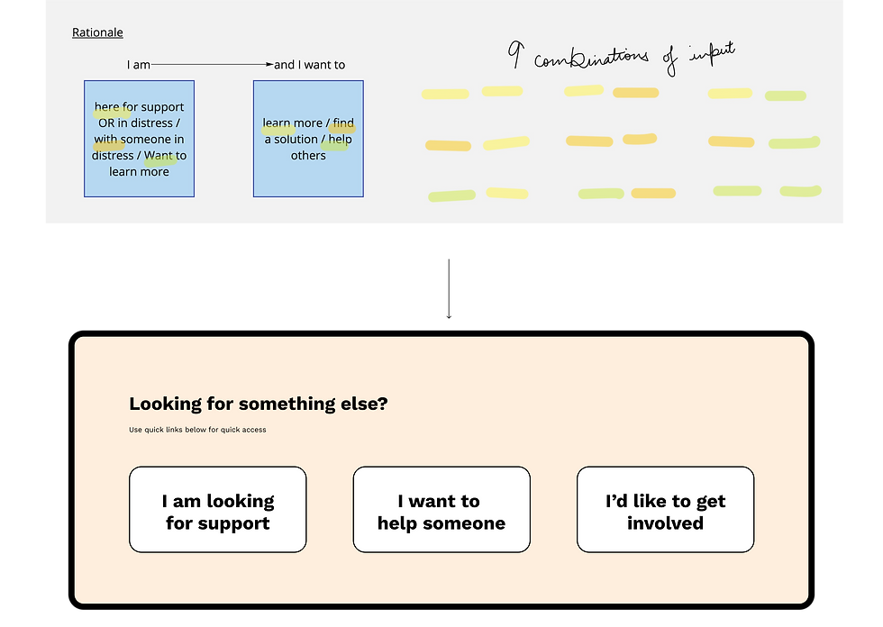
A major methodology applied to breakdown all actions and functions of the website was with this approach:


04-Defining the experience
User Experience
After the initial research and learning from the massive database of user interviews and background of documentaries, a few themes stood out.
(1)
Language: many young users didn’t connect with formal terms like “mental illness” or “intervention.” They spoke in everyday, emotionally ambiguous language: “I’m tired,” “I feel empty,” “I just want it to stop.”
(2)
Necessary Anonymity: Judgment and stigma often silenced them, even online.
(3)
Immediacy: something that worked without requiring them to fill forms, book appointments, or explain everything from scratch.
We also reviewed global and Indian mental health platforms, noting how many defaulted to clinical aesthetics, overly complex interfaces, or distressing imagery. These were all things we knew we wanted to avoid.
Our research sharpened the design direction: build something emotionally safe, culturally relevant, and navigable within seconds, even by someone in acute distress. That became the north star for everything that followed.
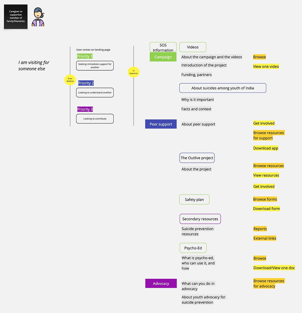
The flows were mainly split in two approaches for two kinds of users.
But as this is a suicide prevention website, the design had to cater to both categories of people seeking help.
Young people seeking help for themselves
Friends or families seeking help for young people
.jpg)
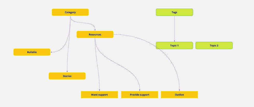
The platform architecture was developed in extensive detail to iron out every possible pathway an individual could take. Because of the subject matter, there was an added sense of urgency in choosing the best option, which here meant fastest and most coherent.
Behind every UX decision was a single principle: make it feel like someone is sitting beside you, not diagnosing you.
As the principle offering of the platform was videos*, the prevailing sense of companionship was observed in initial response. This helped amplify my confidence in the approach:
Gently guide, hold space, and offer tools without pressure or panic.
*
Self narrations of individuals on their own journey with depression, suicide ideation, and more.
Shot with storytelling that builds empathy and acts as a comfort.

.jpg)
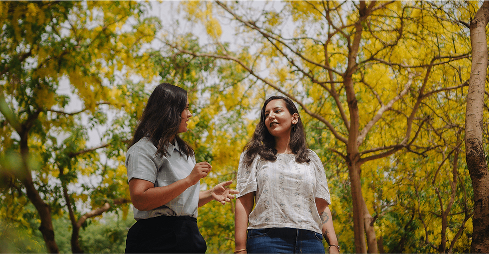
We began by mapping the emotional states a user might arrive in: overwhelmed, numb, looking for help, or seeking to support someone else. From there, we defined three core journeys, “I need help now,” “I want to explore on my own,” and “I want to help a friend.” Each path had to feel intuitive, non-linear, and non-triggering.
The site architecture prioritized clarity over density. We reduced choice paralysis by guiding users through short, focused flows. Urgent resources (like helplines or grounding tools) were surfaced within one click. For those exploring, we created a clean structure of themes, coping, grief, loneliness, self-worth, written in plain, relatable language.

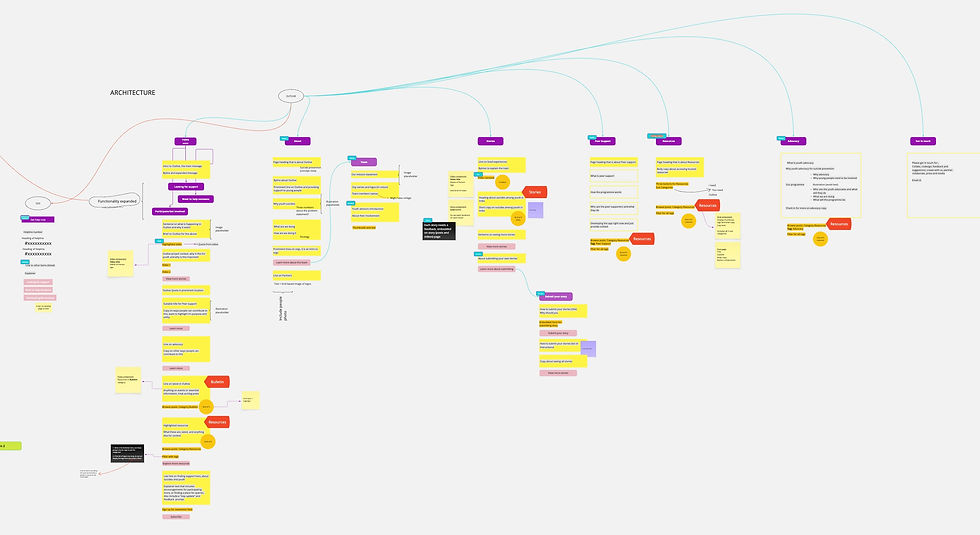
User Interface
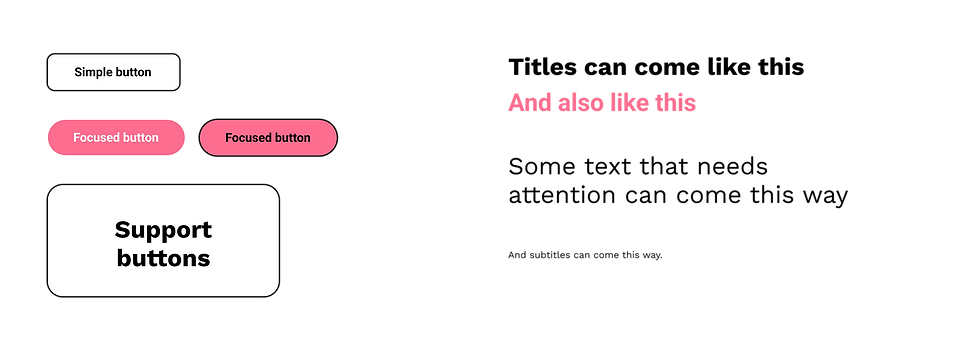
I also leaned towards an intentional decision to not over-brand the platform. I kept the design system soft, neutral, and supportive, never overwhelming or loud. Typography was accessible, colors were warm and non-clinical, and CTAs were designed to feel like invitations, not commands.
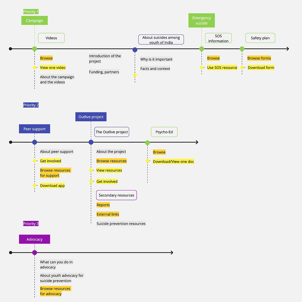.jpg)
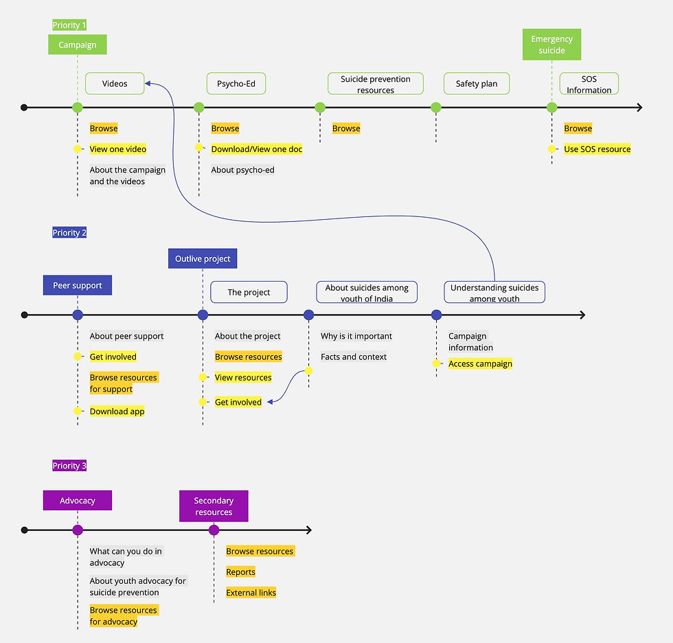
05-Design system and finishing touches
Once the entire experience was laid out, drafted and low fidelity wireframes completed, in quick succession came the branding expansion.
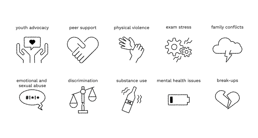
The project was more than UXUI effort, but a real endeavour in thinking and designing with extreme caution and care for an audience with whom sensitivity is paramount.
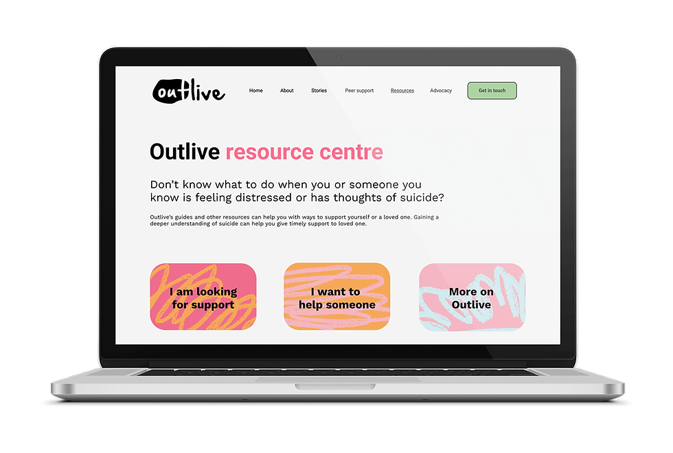
To explore more projects, click here.
