
PRIDE-Pod Adventures
How design and branding for POD Adventures, an evidence-based adolescent mental health game, used playful abstraction and cultural inclusivity to support mental well-being in Indian schools.
User Experience
User Interface
Publication
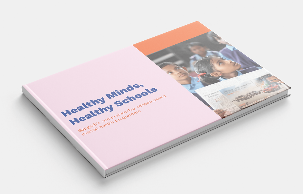
POD Adventures is a game-based, counselor-supported smartphone intervention developed under the Wellcome Trust–funded PRIDE programme to build problem-solving skills and resilience among adolescents (ages 12–19) in Indian schools (New Delhi and Goa). The identity combines abstract, joyful branding with bilingual manuals and a cheerful adult-facing website to ensure clarity, cultural inclusivity, and effective learning in low-resource educational settings.
Explore similar projects:

_gif.gif)
01-Strategy
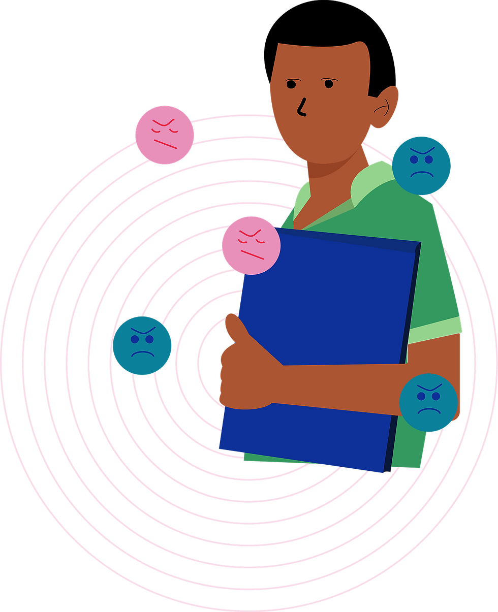
Psychological Playfulness for Adolescents
POD Adventures was developed under the PRIDE program (2016–2022), a Wellcome Trust–funded effort led by Sangath in collaboration with institutions like Harvard Medical School and University of Sussex. The app and its branding were tailored to offline school environments and diverse adolescent users in low-resource contexts.
-
No region-specific or culturally loaded imagery was used to maintain neutrality.
-
Lightweight design made the materials accessible offline on shared school devices.
-
User testing emphasized simplicity, relatability, and real-world applicability.
The branding for POD Adventures was part of the PRIDE initiative, funded by the Wellcome Trust, focusing on scalable, evidence-based mental health interventions for Indian adolescents (ages 12–19) in Goa and Delhi.
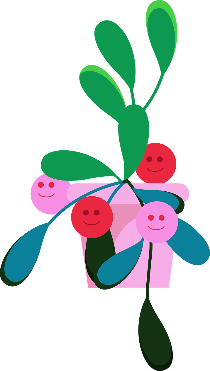
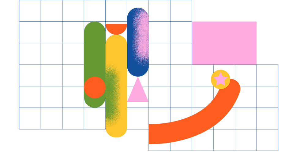
Bright geometric shapes and a vibrant color palette were used to create an emotionally warm, playful visual identity that appeals to adolescents yet feels inclusive and approachable. Abstract imagery avoided competing with the game's character-based aesthetic, offering cognitive space for creative engagement.
-
Color psychology principles guided the joyful palette, delivering energy and positivity.
-
Simplicity ensured clarity and reduced cognitive overload.
-
Abstract shapes invited imaginative interpretation without narrative restriction.
YEAR
2022
TYPE
B2C
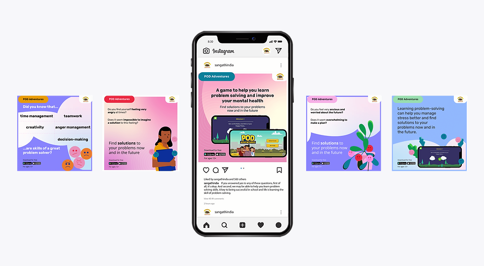
This POD Adventures game is ideally for adolescents aged 13-19 who are facing problems and/or stress and would like help. The website and extended materials, however, are for adults who are looking for solutions to help adloscents in their care work on their mental health.

Some pillars like sensitivity, kindness, joyfulness are a given for this project. Because of the sensitive nature of the app and the state of mind of the people using it, we had a single slogan to drive our strategy: Anti-Anxiety.
02-Development
Structured Creativity for Adult Stakeholders
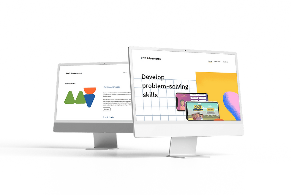
The POD Adventures website was designed primarily for adults, educators, counsellors, and policymakers, providing guidance on adolescent mental health care while maintaining a cheerful, encouraging tone. This structure emphasizes educational value over game-style visuals and reinforces clarity for non-specialist users.
Cheerful yet structured visual storytelling helps adult users navigate adolescent mental health materials with clarity and engagement.
-
Shape-based layouts segment site content for intuitive navigation.
-
Motion cues mirror the app’s narrative arcs, reinforcing psychological progression.
-
Avoiding character branding ensures focus remains on methodology and learning.
"It would be idea to have a cheerful brand identity and website for POD Adventures and sort of balance the fact that adults will go through it but it is indeed meant children."
Project manager [Goa]
Bilingual touchpoints
The unified design language helps counselors and students connect digital experiences to print materials with ease.
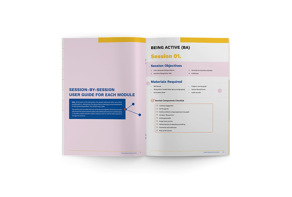
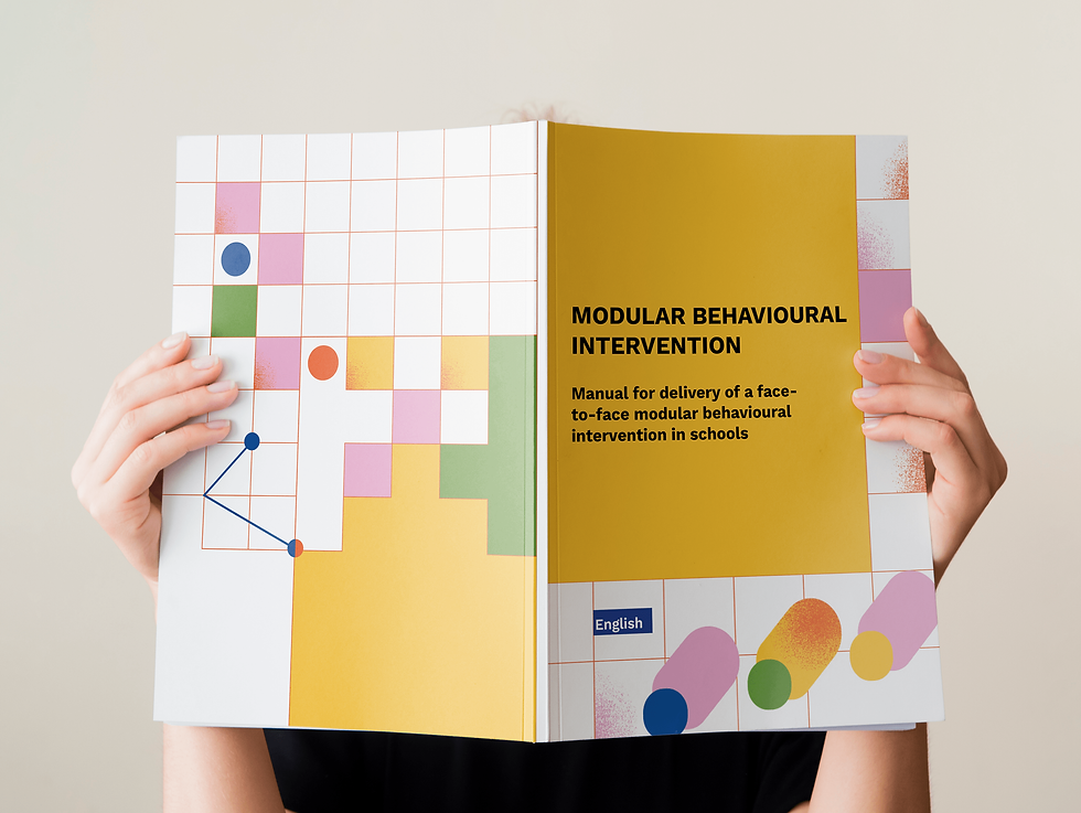
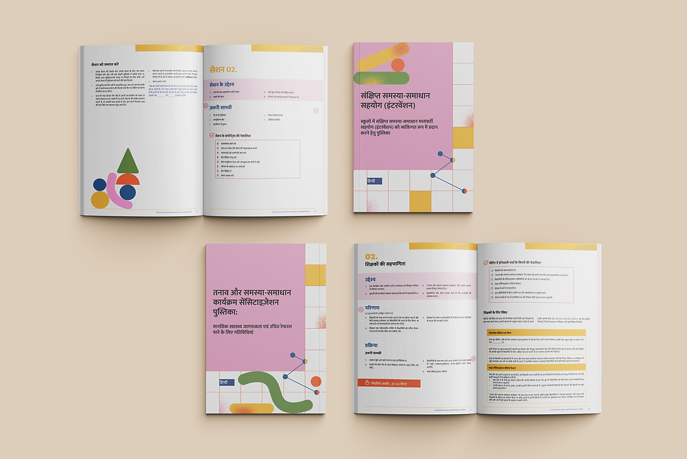
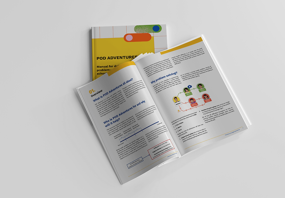
I produced digital and printed manuals in both English and Hindi, adopting the same visual brand elements as the website to foster familiarity and consistency across mediums. This bilingual strategy supports schools in Goa and Delhi, ensuring linguistic accessibility and reducing barriers to usage.
-
The same palette and abstract shapes appear across print and digital channels.
-
Bilingual delivery enhances inclusivity and usability in low-resource schools.
-
Visual repetition reinforces intuitive understanding during guided learning sessions.
VARIABILITY IN USERS FOR THE UNIFIED BRANDING
Parents/Adults seeking the app for their wards
Counsellors and individuals working with adloscents for their mental health
To explore more projects, click here.