
International Planned Parenthood Federation
Designing communication systems for rights-based advocacy, across borders and bandwidths
Visual Design
Brand and Identity
Motion Design


Over two years, I led the communication design function for IPPF’s South Asia Region, shaping how an international NGO tells its story across advocacy campaigns and communication collateral. I managed the communication design for about seven countries. I built scalable systems for impact-led content, redesigned internal comms flows, and produced work that balanced clarity, speed, and political nuance.
01-Why Content Design Matters in the Development Sector
YEAR
2021-2023
TYPE
B2B + B2B2C


The development sector doesn’t just need to inform, it needs to persuade, mobilise, and build trust. Communication isn’t an accessory to the work; it is the work. Whether you’re talking to governments, donors, or the public, the message needs to be understood and felt.
But impact communication sits at an awkward intersection,
of urgency and nuance.
The usual concerns with design for impact are:
-
It’s mission-driven, but often full of jargon or large portions of essential information
-
It wants reach, but can’t always simplify or loose information for the sake of short communication
-
It serves many audiences, with very different needs, with varying levels of knowledge and understanding
Designing content for this space means choosing clarity over cleverness, and empathy over aesthetics. The challenge isn’t to make things look good, it’s to make things land.
At IPPF, I translated dense, essential blocks of language into content that felt accessible without diluting its seriousness. Whether it was a campaign on safe abortion or a report on gender equity, the goal was always the same: make the message clear, without flattening its complexity.

Understanding IPPF: Voice, Purpose, and Pressure
Working with IPPF meant stepping into a space where every word carries political, social, and cultural weight. It meant designing for a civil society movement that is locally owned and globally connected, spanning seven countries (India, Pakistan, Bangladesh, Afghanistan, Nepal, Sri Lanka, Bhutan and at one point Maldives and Iran) with vastly different cultural, political, and linguistic contexts. Every piece of content needed to reflect the organisation’s commitment to sexual and reproductive health and rights, while remaining sensitive to how those rights are perceived, challenged, or denied across the region. The voice had to be steady, principled, and inclusive, whether addressing policymakers, young activists, or local communities.


02-From Brief to Message: Designing Around What Matters
In a space like IPPF, the brief is rarely just a creative document, it’s often a mix of strategy, diplomacy, urgency, and lived experience. Sometimes it’s a full-fledged campaign toolkit. Other times a campaign on social media. In some cases it is responses to political changes in the south asian states.
Every asset was a negotiation between what needed to be communicated and what could be meaningfully absorbed.
The real work was in translating those inputs into something legible, impactful, and usable.
-
What should be said?
-
What must not be said?
-
Who’s listening, and who might be?


Campaigns at IPPF often spanned formats, platforms, and countries, what worked as a static post in one region needed to become an animated explainer in another, or a printable poster for field outreach. To manage that variability, I leaned on a modular approach to design.
Each campaign had a visual logic: colours, iconography, typography, structure
Content was broken into reusable blocks

The post was published on April 13, 2022, which was during the period following the Taliban’s takeover of Afghanistan and the U.S. military withdrawal. By early 2022, the humanitarian crisis and rollback of women's rights were escalating. At IPPF, we were at a loss seeing all the damage to years of progress done in the city.
In that time, we wanted to acknowledge and celebrate the work of midwives in that region. It was and still is a difficult era to reflect upon.
.png)
Final comic strip-like post for showcasing the work of midwives in Afghanistan.

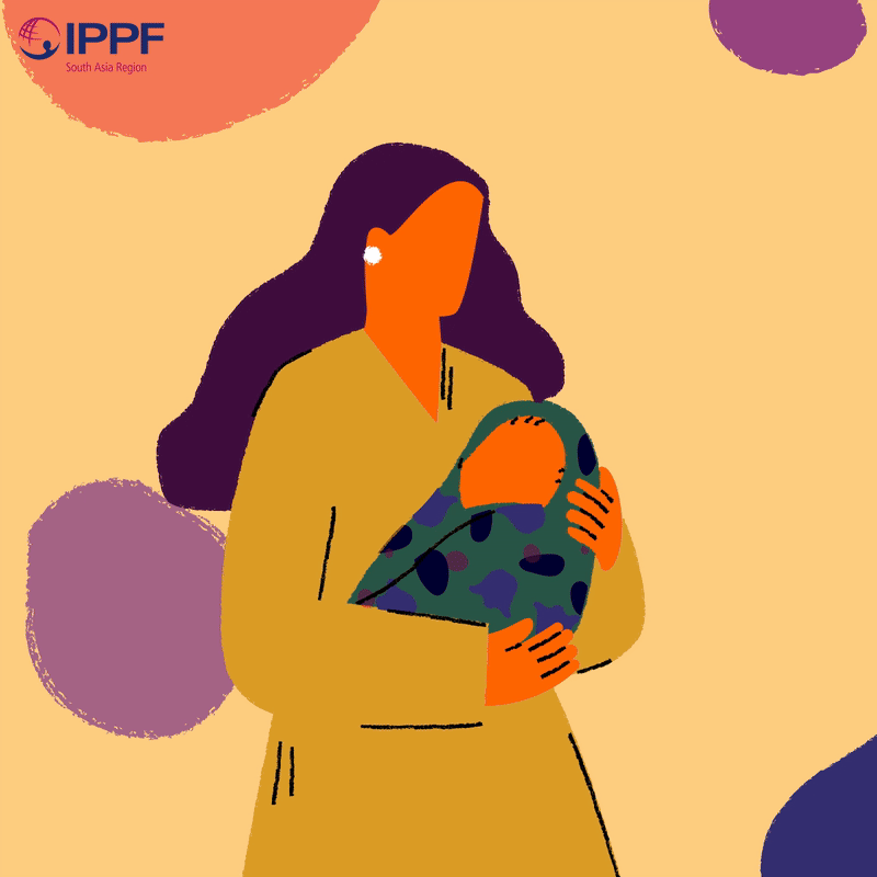
The reel is a short, engaging visual on breast feeding access and safety in South Asia.
I always lean on positive imagery to make any communication for a sensitive topic. This is certainly not applicable in all instances, but in the time of working on many briefs at IPPF, the ones with a positive approach rather than a reprimand or shock value were talked of more.


_gif.gif)


_gif.gif)


Apart from outreach, a lot of work was done to take care of internal materials, items used fro sharing with funders and external organisations, events and programes.
The IPPF branding for the South Asia was lacking and needed expansion and inclusion throughout the collateral. This was also essential as the central branch of IPPF was doubling down on branding.
Within a few weeks at the beginning of my work there, brand identity in IPPF collateral on all fronts was second nature and treated as essential requirement.


