
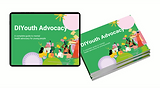
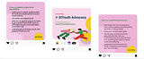
DIYAdvocacy
The platform is a tool for young people to access information on how to create change in their own communities.
User Experience
User Interface
Identity Design
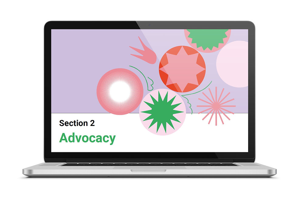
Toolkit Development
Toolkit Development
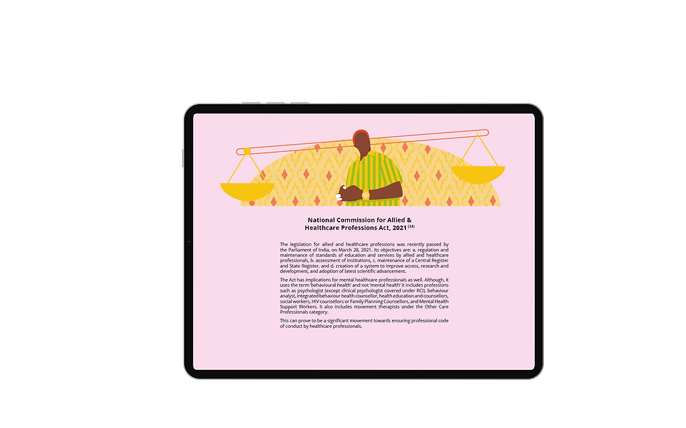
Publication
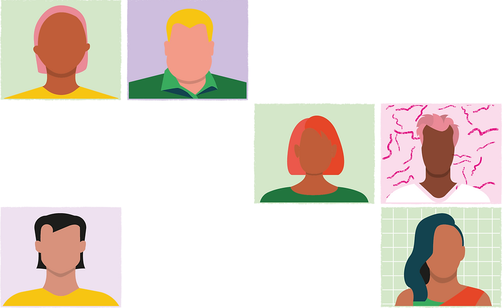
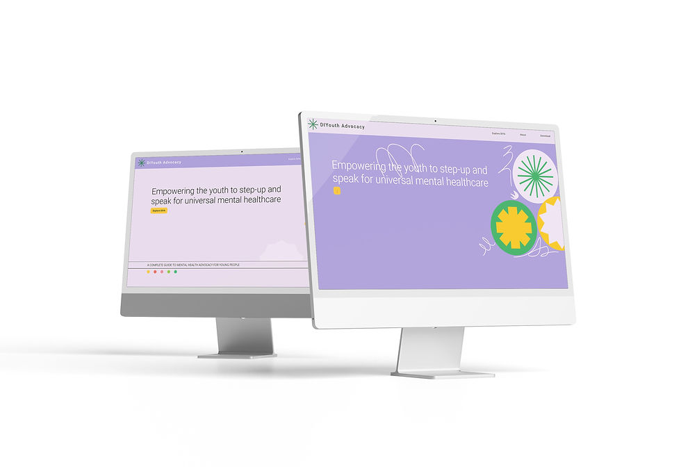
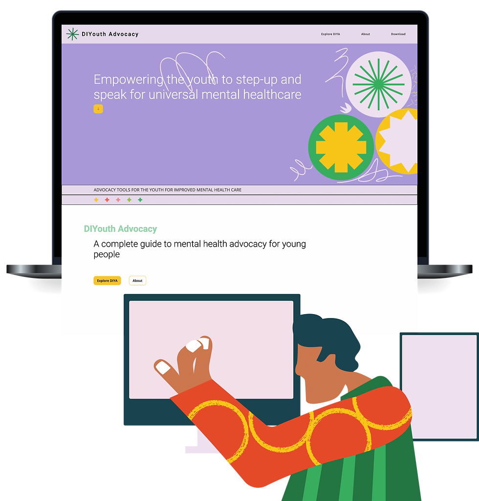
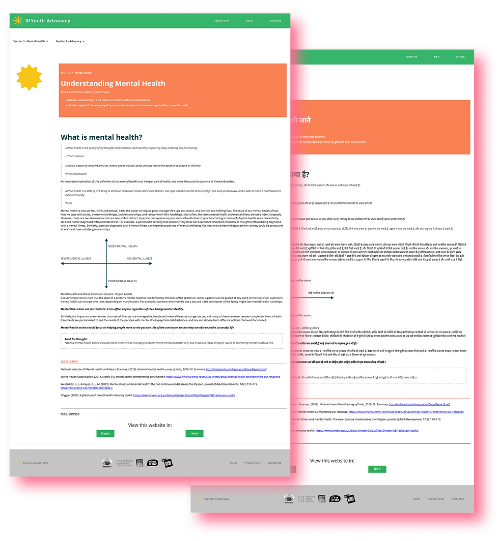
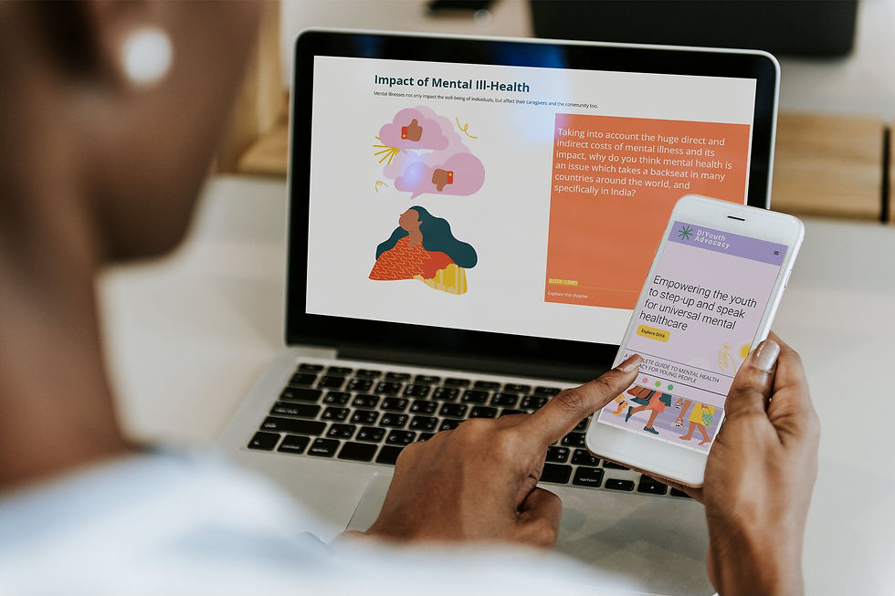
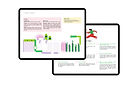
I designed and coded the DIYouth Advocacy toolkit website in Webflow, transforming a content-heavy do-it-yourself resource into an accessible, mobile-first advocacy tool for youth across India. Working from concept frameworks created in youth-led workshops, I crafted a visual identity, UX flows, interactive components, and optimized multiscreen layouts for diverse audiences including NGOs, government stakeholders, and young change-makers. The toolkit was also build for English and Hindi languages.
Success metrics:
-
Reached 8,500+ youth directly through 112 community events and workshops
-
Engaged 294 youth advisors and co-design participants in developing the toolkit building blocks together
Explore similar projects:

01-Understanding the problem and requirement
Brief
A self-serve, modular digital toolkit designed for youth to plan and lead advocacy campaigns around mental health rights. Built in Webflow, the platform blends guidance flows, downloadable assets, and interactive design without external plugins or heavy development dependencies.
There was essential focus on localisation and keeping the website usable in low internet areas.
Context
Sangath and Mariwala Health Initiative received funding to empower young people through mental health advocacy. With only a mission and funding, they needed a digital toolkit that youth could use independently. I collaborated with real youth advocates in early workshops to define foundational building blocks, which was used to build the toolkit in print and digital forms. My role was to find and define frameworks, and bring them to life as a working website and interactive design system.
My Role
-
Facilitated youth-led workshops to define advocacy flow architecture
-
Built the UX structure, navigation and information hierarchy
-
Designed UI visual identity: color palette, components, layouts
-
Coded the full toolkit site in Webflow, including custom CMS and interactions
-
Ensured accessibility and cross-device performance
YEAR
2022
TYPE
B2C
The DIYA platform was built with the youth in mind, to cater to complex requirements for impact-work in easy modules where information is presented in progressive flow of real advocacy work.
02-Design process
Premise
A toolkit young people could actually use, without waiting for permission
Young advocates needed a guided, step-by-step digital space to structure their initiatives, from identifying community issues to planning campaigns.
Workshops & Research
We ran multiple workshops with young advocates to understand users’ aspirations, workflow barriers, and resource expectations. That input shaped the modular content structure and flow logic.
Visual Identity & Assets
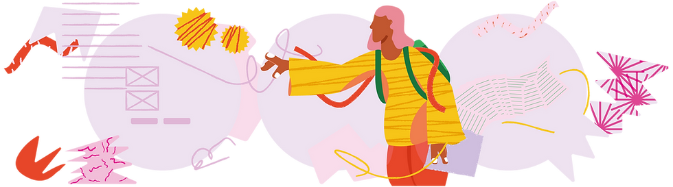
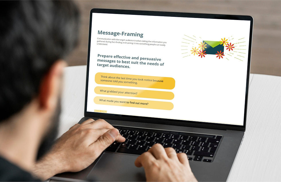
I created a visual system that felt serious yet motivating: neutral colors grounded the site, while accent tones highlighted modular steps. Graphic elements like icons, action cards, and flow diagrams complemented the toolkit’s logical sequence, turning workbook-style content into digital modules.
Implementation in Webflow
The website is built entirely in Webflow, using custom CMS collections for toolkit parts, embed functionality for downloadable templates, and bunch of little details that enhanced the entire experience. Handling very long pages and automatic internal linking posed challenges, but were all addressed in the course of development.

The most essential design was the toolkit page, which was designed to encompass the entire advocacy process and lead the user to the useful information at each step.
The entire website is a web of information to answer a simple question, "How do I get started and go ahead with bringing change in my community?"
Each section was introduced with at this stage with summary information, and led to individual chapters.
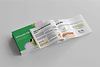
Publication & Social Expansion
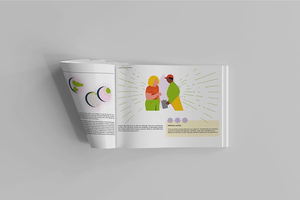
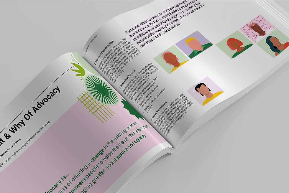
The physical and downloadable toolkit was designed to feel functional yet grounded, something youth could actively use, carry, annotate, and share. I built a visual system that balanced structure with approachability: generous margins, modular blocks, accessible typography, and soft contrast tones helped prevent fatigue during heavy reading. The layouts mirrored the website's navigation logic, so users could intuitively move between print and digital. Icons, flow arrows, and visual breakpoints were intentionally placed to support quick reference, whether someone was skimming, facilitating a group activity, or working alone on their campaign. Though the content was authored separately, the design system ensured it was presented with clarity, energy, and respect for the user’s journey.

03-Conclusion
Designing clarity, confidence, and ownership into every step of youth advocacy
This toolkit project showcases how thoughtful UX/UI design can elevate a content-rich, youth-led initiative into a self-sufficient, digitally empowered resource. From workshops to Webflow build, my work made a complex toolkit feel accessible, and ready to scale to thousands of young advocates across India.

To explore more projects, click here.